
ILM Unveils New Group of Logos, Marking a New Era of Innovation
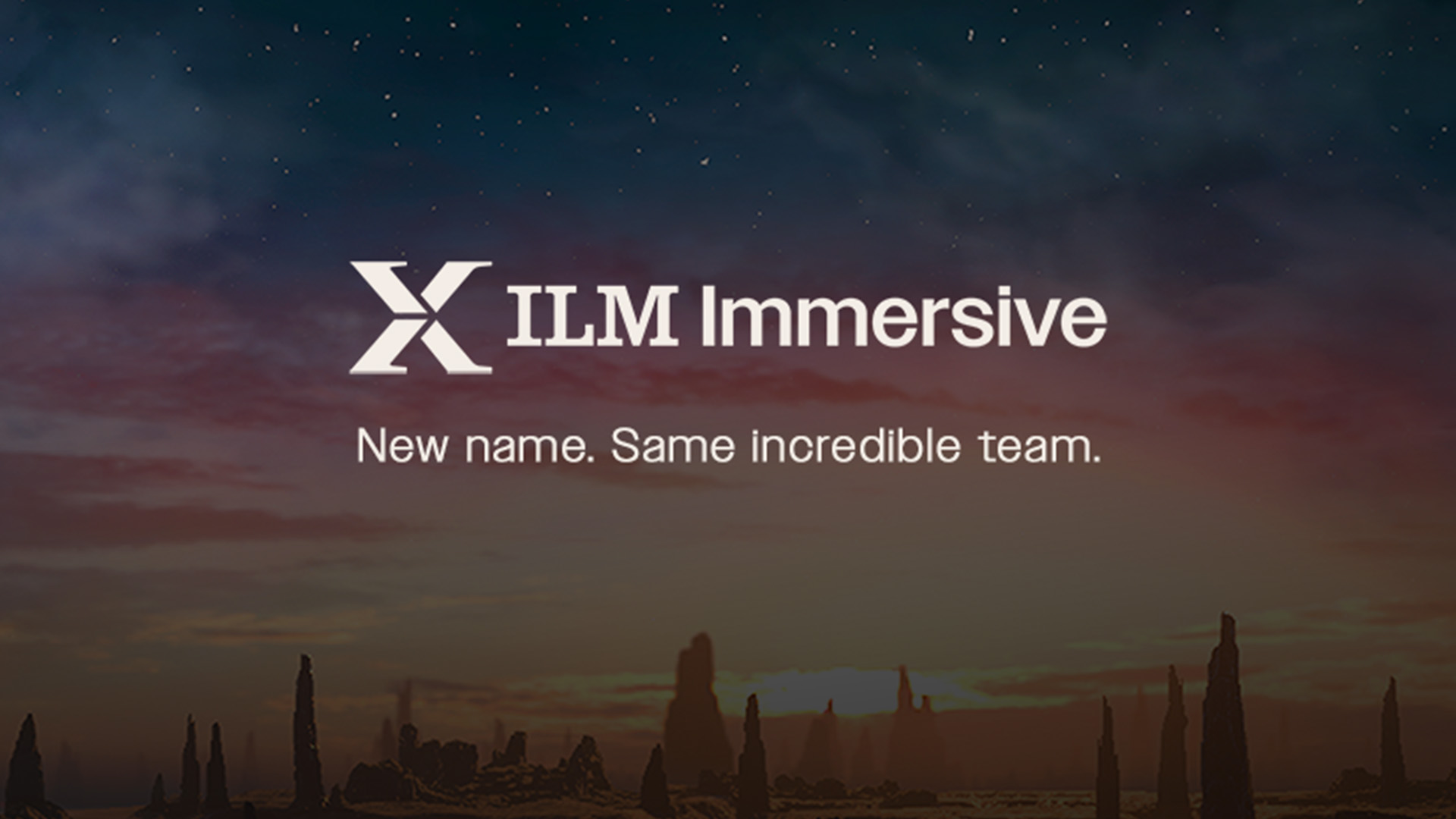
As ILM introduces a new look, ILMxLAB changes its name to ILM Immersive.
Industrial Light & Magic (ILM) has unveiled a new series of logos that restate its iconic status as the world’s premier visual effects company. As part of this cohesive effort across all of ILM’s sub-brands, immersive entertainment studio ILMxLAB has also officially changed its name to ILM Immersive. After more than a year of work in partnership with the Southern California design studio Hoodzpah, these changes reflect a new chapter for ILM as it approaches its 50th anniversary in 2025.

It’s been nearly two decades since the company last undertook such an effort. “A lot has changed since then,” says Rob Bredow, SVP chief creative officer, ILM. “Our core values have remained the same — people, innovation, and the highest-quality work. But now we’re in six countries with a team of over 3,000.” Not only has the company expanded physically, but into new technologies and storytelling mediums as well.
“One of those new establishments was ILMxLAB,” notes Bredow. “We had imagined that original name might be useful for the first few years of our existence in immersive entertainment, but it’s actually lasted even longer, and now we’re really happy to have a new direction — ILM Immersive — that better represents the variety of work we do.”
For Vicki Dobbs Beck, VP of immersive content, the name change almost “feels like we’ve graduated!” she says. “When we came up with the initial name, we obviously wanted to be associated with ILM, but we also wanted to acknowledge that we were in a nascent industry. We knew that we were going to have to experiment, explore, and learn, much like a traditional lab. The ‘X’ was a piece of the name and logo that has been carried forward. It was inspired by an X-wing, and it has rooted us in Lucasfilm. In recent years, we have become a much more robust part of ILM’s portfolio. This next step in our evolution is a really exciting moment and sets us up for a new era of immersive storytelling.”
This new era has its eyes on “mixed reality,” an evolving medium that integrates both virtual reality, “where we transport people to different worlds,” as Dobbs Beck puts it, and augmented reality, “where we help people see our world differently.” It’s all driven by storytelling and experimentation. “We want to retain the notion that we are an innovation hub and will continue to create first-of-kind experiences that push the state-of-the-art.”
A major component of ILM’s overall rebrand process involved going straight to the people of the company themselves. “We had over 1,000 employees join us in various meetings and interviews,” explains Bredow. “They each shared what makes ILM unique and what they wanted to see updated in a new brand.”
Hoodzpah’s co-founders Amy and Jennifer Hood (who also happen to be twin-sisters) participated in many of the interviews and discussions. “Everyone was so eager to see something exciting and fresh,” explains Amy. “They weren’t too beholden to anything, and yet, they all really loved the rich history of the cog and the bulb.” Jennifer adds that “In a way, we knew what we had to do from the start. We needed to go back to the roots, but make it feel relevant and modern. You want some nostalgia, but you also want to look to the future.”
“When we asked people questions, the one thing they always lit up for was, ‘What’s your earliest memory of ILM?’” Jennifer continues. “Either the first moment they saw an effect in a movie, or their first day on the job. Everyone was like a kid at Disneyland. That’s how we felt too. I remember when Amy first ran out of the office saying, ‘Guess who emailed us?! ILM!’ It’s how everyone feels when they get to work for a place as cool as this.”
After more than a decade working with entertainment companies like Disney, Nike, and Red Bull, this is one of Hoodzpah’s most in-depth projects to date. “We’re working on everything from hiring cards to event booths to the website, social media, and logo animation,” says Jennifer. As Amy explains, in their experience at different companies, “Sometimes it can be hard in a rebrand of this scale to get all the various people and teams on the same page as far as the vision. But we were so impressed by the cohesive sense of self and purpose among the ILM team members. Whether they had been working at ILM for six years or six weeks, they had such a clear sense of ‘this is who ILM is, this is what we stand for and what we should be going forward.’”
One person who’s been at ILM for decades is executive creative director John Knoll, and according to Rob Bredow, Knoll explained that “looking at the current brand, he wanted to see more of the ‘magic’ of ILM. In our new mark, you’ll see that kind of magic swoosh. It represents a couple of different things. There’s ‘magic’ of our name, which is one of our values; we’re innovative magic makers. But it also represents that newer global aspect. It’s swooshing around an imaginary globe, only it’s a lightbulb with the gears on it.”
As Jennifer Hood adds, “Every time we would interview a studio in a different location, they’d say, ‘We have to show that we’re global, but without putting a million flags in the logo.’ How do you represent that? We use the bulb and cog almost like it is its own planet, and that magic spark of innovation is soaring around it.”
In addition to ILM’s primary logo, ILM’s sub-brands have also been updated for a unified logo family. This included groups with established iconography like ILM Immersive and ILM StageCraft, as well as the newer group, Technoprops, who “didn’t have as much equity in their mark,” as Jennifer puts it. “Their logo changed the most. The goal over all was to make the parent brand and sub-brand logos look cohesive, but not homogenized. They retain their own personality in the glyphs.”
For the typography, the Hoodzpah team went back to the iconic logo illustrated by Drew Struzan in the early 1980s (and inspired by an earlier version by Michael Pangrazio). “We explored all sorts of different custom-type options,” says Amy. “In the end the final wordmark is a slab serif closely inspired by the Drew Struzan logo. It’s timeless. I feel like it is still going to be relevant for the next 20 or 30 years.”
They discovered to their delight that the font style created a subtle “holding device,” as they put it. “The rounded, Serif letters create a holding device like a movie screen or frames on strip of film,” says Amy. “That became a motif.”
ILM is unusual in that it’s recognizable both in the professional entertainment industry as well as with the general audience and fans. Its iconography, therefore, needs to serve all of these tasks at once. “You can imagine that updating a brand like ILM’s is a bit of a daunting task,” Rob Bredow concludes. “It’s a storied company with an amazing history. If you look at the logos we’ve used over the years, they’re all fantastic. They’re of their time and they communicate a lot. When Jen and Amy came in with their pitch, they talked about making sure that we are communicating the story of our brand. What we are about and what are our values. It was a really fun exercise. We started just over a year ago, coming out of the pandemic. As we compared notes about our values, over and over again, it was about the people, the innovation, and the quality we can deliver. It was a great reminder of what an amazing place ILM is.”
To see more, visit ILM’s newly re-designed website.
Lucasfilm | Timeless stories. Innovative storytelling.
Lucas O. Seastrom is a writer and historian at Lucasfilm.