New Indiana Jones Art Prints Capture the Hero’s First Three Adventures
Lucasfilm and ACME Archives Partner Up for a Limited Edition Series
Fans of the globetrotting, whip-cracking archaeologist Indiana Jones can now memorialize the hero’s first three adventures with a brand-new series of art prints from Acme Archives and artist Eric Elia.
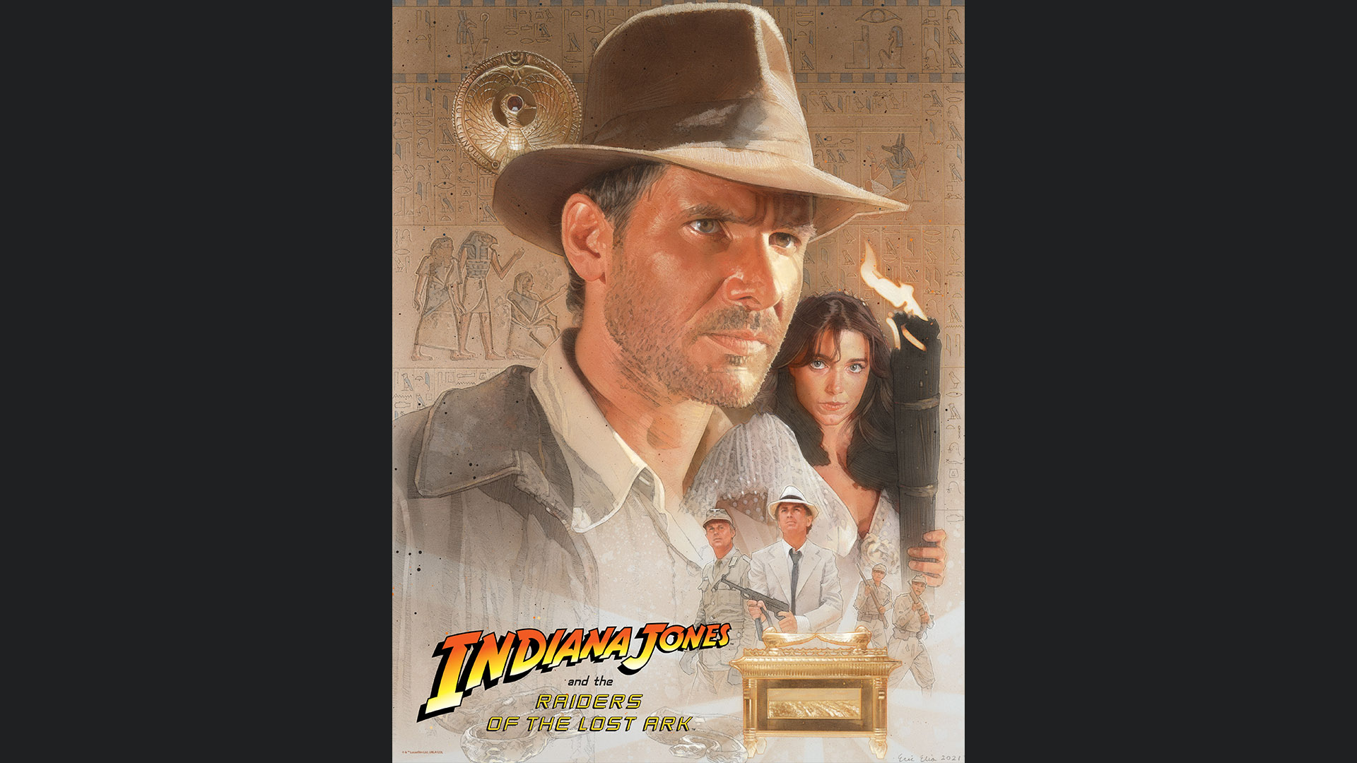
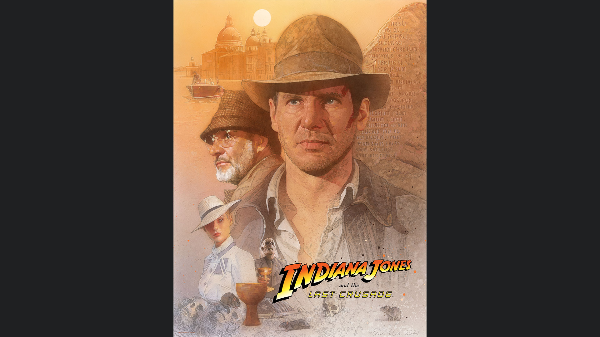
Capturing the worldly and mysterious reputation first ascribed to Indy in Raiders of the Lost Ark, the pieces are titled “Professor of Archaeology,” “Expert on the Occult,” and “Obtainer of Rare Antiquities.” Limited to an edition of 250, they’re available as 18″ x 24″ lithographs. View the art below and visit DarkInkArt.com to learn more.
“Professor of Archaeology”
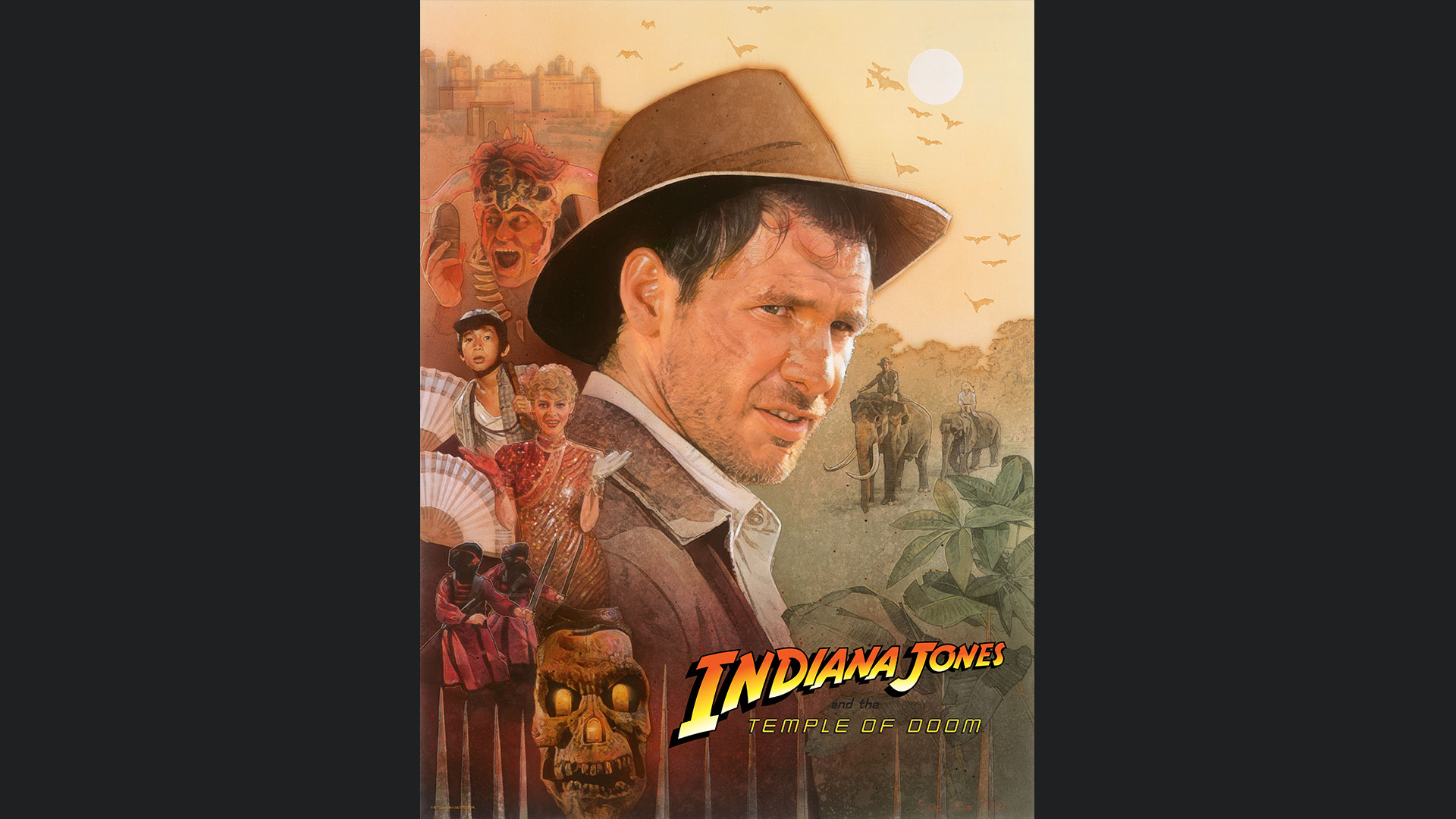
“Expert on the Occult”
“Obtainer of Rare Antiquities”
Artist Eric Elia answered some questions from Lucasfilm about his creative process and inspiration from the series.
Do you remember your first viewing of an Indiana Jones film? If so, what impression did it make?
I first saw Raiders of the Lost Ark at home on VHS when I was a child. My family and relatives are movie fans and had a fair collection of movies. I was instantly attracted to the cover art by Richard Amsel – it was so mysterious. I loved the way it played with history and legend, and still can’t get the music out of my head.
On your website, you describe that one of the ways you learned about art techniques when you were younger was by recreating favorite movie posters or scenes. Was Indiana Jones (or other Lucasfilm productions) among these, and if so, did you have a favorite poster or scene?
One of my first oil portraits was a copy of Indy stealing the golden idol. I also painted a copy of Drew Struzan’s Indiana Jones and the Last Crusade poster art to learn airbrushing. My favorite Indiana Jones poster is his for Indiana Jones and the Temple of Doom, with its vibrant oranges and green/blues.
How does the color palette of the Indiana Jones series reflect its core themes? How does this palette inspire you?
The earthy cinematography of each film inspired my color palette. For each poster, I chose two basic, complementary colors that reflected each film’s primary location(s) and tone: the tans and teal of Raiders’ Tanis dessert, the reds and greens of Temple of Doom’s fires and jungles, and the yellow/peach and purple of Last Crusade’s desert and canyon. I chose a higher contrast between colors to reflect Temple of Doom’s scary atmosphere, and a warmer palette to capture the emotional father-son reconciliation of Last Crusade.
What artistic techniques did you use? How does your choice of technique relate to your chosen style?
I use traditional media in a realistic style to create my art. The Indiana Jones films have a long history of traditional artwork that really complements the old-world aesthetic of Indiana Jones and its 1930s – ‘50s adventure film roots. I wanted to emulate the grittier illustrative quality of Richard Amsel and Drew Struzan, and used a similar technique to theirs, overlaying airbrushed acrylic paint over a gessoed board to tint my pencil drawing and later add detail using colored pencil.
Can you discuss the design process for this artwork? How did you choose each of the iconic moments from the film?
Designing each poster as a part of a triptych was challenging. I love painting portraits and wanted this series to be character-driven rather than scene-specific. I relied on screenshots and production stills for characters, sometimes combining references to composite an original pose, like Marion’s. I started my design with a list of things I as a fan would want to see in a poster, using the central artifact to anchor the bottom corner of each diagonal composition.
Was any one of the posters the most challenging, and if so, why?
Temple of Doom’s poster was definitely the most challenging, largely because of the number of individual references that I combined and the small scale of Willie and Short Round’s faces.
The titles of these pieces are derived from a line of dialogue in Raiders of the Lost Ark. Could you discuss how this was chosen?
The dialogue in Raiders is so efficient and memorable. The scene between Indy and Army Intelligence sets the plot in motion (and has such a forbidding tone). The line spoken to Indy, “Professor of Archaeology, Expert on the Occult, and, how does one say it? Obtainer of rare antiquities” perfectly sums up Indy’s character, and coincidentally happens to have three facets that matched this triptych’s motifs. I designed Raiders to have an archaeological motif using the Well of Souls, Temple of Doom to feature the exotic Thuggee cult, and Last Crusade to focus on grail artifacts like the cup and tablet.
Do you have a personal favorite scene in an Indiana Jones film, and if so, why?
My favorite scene is also the first I had seen – the opening idol scene in Raiders. John William’s sinister music throughout really makes the scene for me, and who doesn’t remember the grimacing golden idol?
Other than Indy himself, do you have a favorite character in the series, and if so, why? Do you have a favorite line of dialogue from that character?
Sean Connery is so memorable and funny as Henry Jones, Sr. His chemistry with Harrison Ford makes Last Crusade the funniest of the series, but he projects such wisdom and believability too. “Junior, I’ve got to tell you something…” “Don’t get sentimental now Dad, save it ‘til we get out.” “…The floor’s on fire.”
In the process of creating these works, did you learn anything new or surprising about the films?
It wasn’t until painting these that I realized the subtle but distinct differences between each films’ fedora shape, and the costuming details behind it. For instance, Raiders’ hat has a taller, narrow-pinched crown that’s asymmetrical, Temple of Doom’s crown is shorter and soft, and Last Crusade’s is tallest.
To Learn More About These Limited Edition Prints, Visit DarkInkArt.com —
Lucas O. Seastrom is a writer and historian at Lucasfilm.